Featured Post

List of Monthly Drawing Challenges for WHOLE Year

Update 01-04-2018: I did it! I uploaded for Inktober 2017! Well, I'm still uploading for it. But that's because I want to hit my go...

Thursday, October 30, 2014

Sketch Diary: TBT - Scratch art fashionista

This one is a way-back throwback! Anyone recognize it? It's from the Fall of 2004 and ended up being a gift to my Mom. This was probably the second time I had messed with scratch art boards. If I remember correctly, I used a picture out of some random fashion magazine as a reference for this woman. 
It's supposed to be lace on her arms and feathers coming out of the top of the dress, is that obvious? It's always educational going back to old drawings like this - sometimes it's easier to see the progress and sometimes I wonder why I forgot certain techniques along the way. I think I have some scratch boards hanging around somewhere so maybe I'll do another one for the holidays.

with love - M

Friday, October 24, 2014

Sketch Diary: Harpy priestess concept

Isn't she ADORABLE?! I think so. I'm pretty pleased with myself. It only took... forever to finish this sketch. Such is the curse of having full-time design work. Doesn't leave much time for random sketching. But I was inspired for this little illustration project I'm working on with some folks, The Compendium. It's a nice way to motivate each other to draw more regularly and with purpose without any real deadline to stress us out.

Anyway, what I mentioned when I first uploaded this sketch there was this whole priestess thing. "I'm not sure why but I like the idea of harpies being priestesses to the gods. Kind of like an pre-christian idea of angels. But I imagine harpies as being more...gray. Not good but not evil. They do the gods bidding and maintain the great temples or something. Guard the relics, preside over sacrifices, light the sacred candles."
Maybe she needs more cloths? I don't know. I feel like harpies should, in general, be pretty bare.

with love - M

Thursday, October 23, 2014

Sketch Diary: TBT - Fairy concept

Another throwback piece to August 2010, an early attempt with my Copic markers. I just can't get over how much I still love those head pompom thingies. The mushrooms were pretty rushed and I didn't bother filling in the rest of the background. I was more interested in figuring out how to blend properly. This particular hair style, with the side swirly curl, I'm still fond of and if you had access to all my sketches, you'd see it a lot during that summer.

Faeriecon East is coming up and I wanted to upload something fae-like to get me pumped about fae stuff. I think it's working. If you've never been to a faerie convention/festival, it's a lot like other festivals but with LOTS of wonderful costumed folk and usually it takes about a week to get all of the glitter off your body... even if you weren't wearing any. It's just something that happens.

with love - M

Thursday, October 16, 2014

Sketch Diary: TBT - mermaids on the beach

Time for a throwback! This cutie is from January 2010. I wanted some more color on this blog so here's one of my first attempts with my Copic markers. Also... one of few attempts to actually have a real background heh. I don't know why that's so frightening but it is. Still, I remember enjoying drawing the piece initially but when I started coloring I specifically remember that I zoned out and just kind of threw caution (and sense) to the wind when choosing the colors. I went through different phases of love and hate with this piece over time. I think I finally appreciate it for what it is and I'm glad it came out this way. Those clouds are really weird, though. Not sure what was going on there... I assume it's supposed to be sunset? Shouldn't I know these things?! No.

with love - M

Friday, October 10, 2014

Logo - Back Pocket Entertainment - fist of fury!


BAM! How about them apples?! I give you - one of my favorite logos to work on - Back Pocket Entertainment by Matt Martinez. Matt and I came together back in spring of 2014 to create this little guy. I created a bunch of concept sketches best on his ideas and preferences and after a couple rounds, this is what we came to as a 'final' logo. I say 'final' because in my opinion, no logo is ever final. They change as the times and company change. But I think this is a good first step for Back Pocket Entertainment. The image above is the full logo in all it's glory. Below are the separated pieces. Please don't steal - these images and ideas belong to Matt and we would be both be very hurt if our hard work was stolen and exploited. Remember, we're the little guys, not huge corporations.


A little bit about Matt Martinez and Back Pocket Entertainment: Matt is a film guy. Back Pocket Entertainment is currently a podcast/blog site with aspirations of bringing fellow film/comic book/tv enthusiasts reviews and new content from things like interviews with other content creators such as artists, directors, writers, and so on. In short, there's a lot happening over there so keep an eye on it as the site continues to grow. And feel free to give encouragement! It's a fairly new project and if he's making something that you enjoy, be sure to let him know.


So there you have it! Back Pocket Entertainment - welcome to the logo world. I might do a post about the process I went through for this and other logos if that's something that interests people. If you're curious about getting a logo made, fill out this form and we'll go from there. Otherwise, go check out Back Pocket Entertainment!

with love - M

Thursday, October 9, 2014

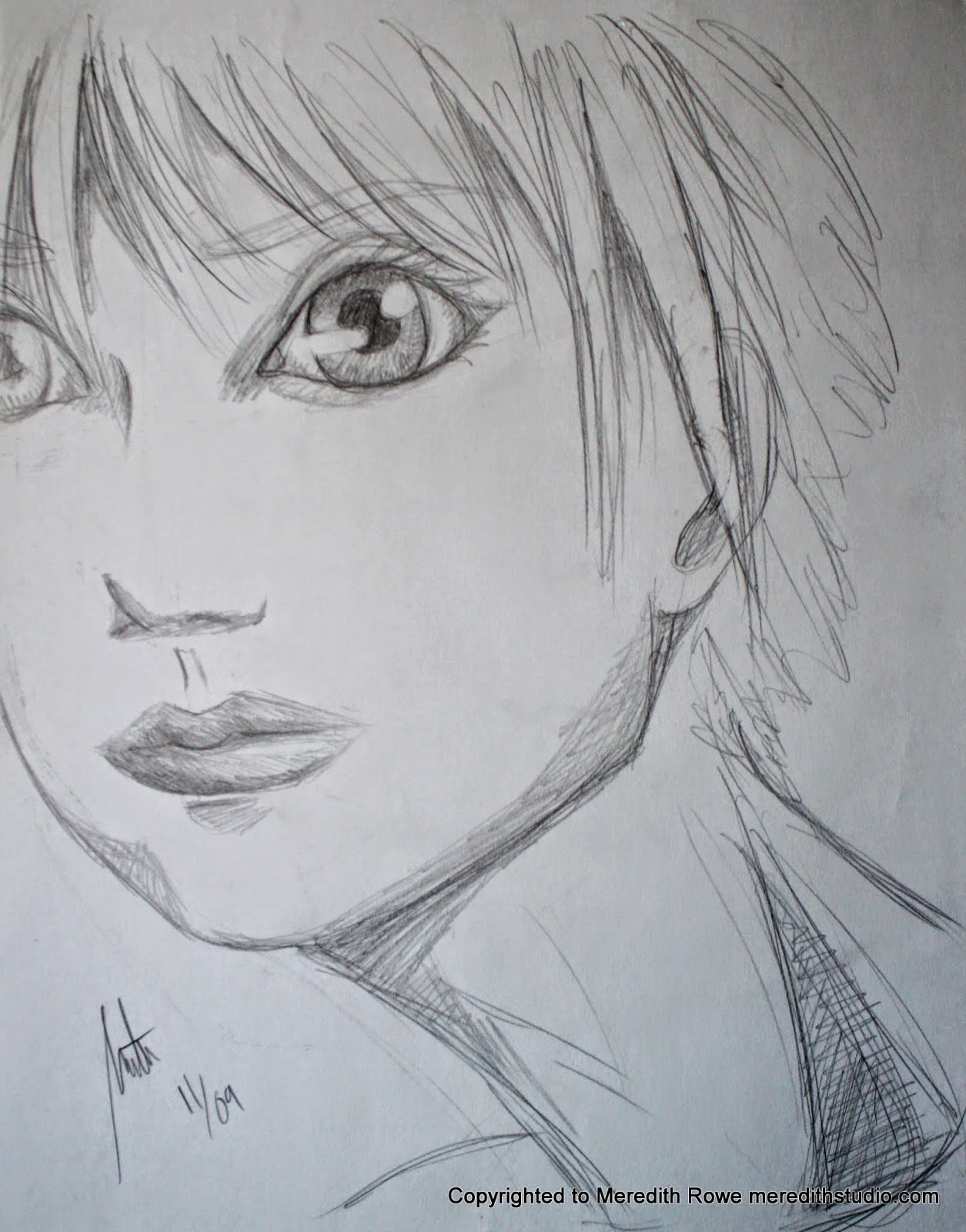
Sketch Diary: TBT - weird proportions face

A little throwback sketch from November of 2009.

Not a clue what I was going for with this sketch. Most likely it's one of those 'I don't know what to draw....' and then the pencil just sort of goes 'blargesndofpaos' all over the page until I feel I've gotten whatever it is out of my system. Sometimes those kinds of sketches turn out something super cool. This was not one of those times. Still, I wanted to share it with you because errors are just as important as successes. Enjoy!

with love - M

Friday, October 3, 2014

New lens! Some test shots with a 50mm


With a new job comes new fun toys! Well, this can also be used for work but you know what I mean. I bought a new 50 mm 1.4 Canon lens this week and here are some of my first shots. Check out the rest of the album here. The puppy up top is my akita, Baku. He's a pretty good sport with photo taking but I think big cameras freak him out a bit. Still, I think I got some nice shots of him.


This super cool boat belonged to my boyfriends grandfather I believe. I love how the 50mm blurs everything but what's being focused on. I think it makes this boat seem bigger and more real.


 Just a view out of my living room windows. Can't wait to try this out with portraits.

with love - M

Thursday, October 2, 2014

Sketch Diary: TBT - LDS girl

Time for a throwback all the way from 2010! I still remember sketching this like it was yesterday. This was one of those pieces, one of those moments where everything came together and I could really see the subject - not with my eyeballs but with my true mind's eye. Clear as clear can be. And if felt like liquid fire running down from my head to my hand. Whenever I look at this sketch now, I feel that same sensation and say to myself "Hey Meredith, you should really sketch more from live subjects - at least use some photos". I was using more photos at one time but have since fallen off the horse. I wanted to post this as a reminder to myself to embrace drawing from photos/ real life more. Pulling from my head is fun and all but I'm not a mentat. It's time to face facts and break out the photos.

Anyway, this sketch was of a young girl in a National Geographic who happened to be a member of the LDS church. Her face just jumped out at me and I felt compelled to try to emulate it. I hope it brings someone the peace it gave me.

with love - M