Featured Post

List of Monthly Drawing Challenges for WHOLE Year

Update 01-04-2018: I did it! I uploaded for Inktober 2017! Well, I'm still uploading for it. But that's because I want to hit my go...

Monday, December 1, 2014

Sketch Diary: Faerie Queen concept

First sketch in weeks! At least it's a detailed one, haha. I got inspired suddenly and had to get this out of my system. I know I've done a lot of headshots lately but hey, better than nothing. My bf doesn't like the neck angle and says the eye is a bit large  but oh well. If I go back to ink it later, maybe I'll adjust it a bit.

with love - M

Friday, November 28, 2014

Sketch Diary: Mary from Reign

Just a quickie sketch of Mary, Queen of Scots, from the show Reign. She had this powerful look in this one shot, like she could see something in the distance that no one else could see. I'm interested in what else that actress will end up doing in the future - I think there's some serious potential there. And the costume designer for the show - love the stuff. I don't think any of it's very period true but I appreciate the ingenuity. I'm hoping to play with making some of the cool hair pieces, the beaded ones that Mary wears that lay flat like a headband/crown. Very pretty.

Happy Friday! Don't terrorize those retail associates too much, ok? I've been there - it means a lot when costumers practice a little patience with all the sale madness.

with love - M

Thursday, November 27, 2014

Sketch Diary: TBT - Faeriecon memories

Things have been super busy so I guess it's time for another TBT! This little beauty is from 2010 though I might not have colored it until 2011, I can't remember. I sketched it out during Faeriecon 2010 and even though the proportions are off and the eyes are set too high, I still really like this piece. Comparing this to more recent marker pieces, it's cool to see how my technique has changed. Going back to review these pieces really helps inspire to keep drawing. When I get really busy, I need that pretty hardcore.

And Happy Turkey Day!

with love - M

Thursday, October 30, 2014

Sketch Diary: TBT - Scratch art fashionista

This one is a way-back throwback! Anyone recognize it? It's from the Fall of 2004 and ended up being a gift to my Mom. This was probably the second time I had messed with scratch art boards. If I remember correctly, I used a picture out of some random fashion magazine as a reference for this woman. 
It's supposed to be lace on her arms and feathers coming out of the top of the dress, is that obvious? It's always educational going back to old drawings like this - sometimes it's easier to see the progress and sometimes I wonder why I forgot certain techniques along the way. I think I have some scratch boards hanging around somewhere so maybe I'll do another one for the holidays.

with love - M

Friday, October 24, 2014

Sketch Diary: Harpy priestess concept

Isn't she ADORABLE?! I think so. I'm pretty pleased with myself. It only took... forever to finish this sketch. Such is the curse of having full-time design work. Doesn't leave much time for random sketching. But I was inspired for this little illustration project I'm working on with some folks, The Compendium. It's a nice way to motivate each other to draw more regularly and with purpose without any real deadline to stress us out.

Anyway, what I mentioned when I first uploaded this sketch there was this whole priestess thing. "I'm not sure why but I like the idea of harpies being priestesses to the gods. Kind of like an pre-christian idea of angels. But I imagine harpies as being more...gray. Not good but not evil. They do the gods bidding and maintain the great temples or something. Guard the relics, preside over sacrifices, light the sacred candles."
Maybe she needs more cloths? I don't know. I feel like harpies should, in general, be pretty bare.

with love - M

Thursday, October 23, 2014

Sketch Diary: TBT - Fairy concept

Another throwback piece to August 2010, an early attempt with my Copic markers. I just can't get over how much I still love those head pompom thingies. The mushrooms were pretty rushed and I didn't bother filling in the rest of the background. I was more interested in figuring out how to blend properly. This particular hair style, with the side swirly curl, I'm still fond of and if you had access to all my sketches, you'd see it a lot during that summer.

Faeriecon East is coming up and I wanted to upload something fae-like to get me pumped about fae stuff. I think it's working. If you've never been to a faerie convention/festival, it's a lot like other festivals but with LOTS of wonderful costumed folk and usually it takes about a week to get all of the glitter off your body... even if you weren't wearing any. It's just something that happens.

with love - M

Thursday, October 16, 2014

Sketch Diary: TBT - mermaids on the beach

Time for a throwback! This cutie is from January 2010. I wanted some more color on this blog so here's one of my first attempts with my Copic markers. Also... one of few attempts to actually have a real background heh. I don't know why that's so frightening but it is. Still, I remember enjoying drawing the piece initially but when I started coloring I specifically remember that I zoned out and just kind of threw caution (and sense) to the wind when choosing the colors. I went through different phases of love and hate with this piece over time. I think I finally appreciate it for what it is and I'm glad it came out this way. Those clouds are really weird, though. Not sure what was going on there... I assume it's supposed to be sunset? Shouldn't I know these things?! No.

with love - M

Friday, October 10, 2014

Logo - Back Pocket Entertainment - fist of fury!


BAM! How about them apples?! I give you - one of my favorite logos to work on - Back Pocket Entertainment by Matt Martinez. Matt and I came together back in spring of 2014 to create this little guy. I created a bunch of concept sketches best on his ideas and preferences and after a couple rounds, this is what we came to as a 'final' logo. I say 'final' because in my opinion, no logo is ever final. They change as the times and company change. But I think this is a good first step for Back Pocket Entertainment. The image above is the full logo in all it's glory. Below are the separated pieces. Please don't steal - these images and ideas belong to Matt and we would be both be very hurt if our hard work was stolen and exploited. Remember, we're the little guys, not huge corporations.


A little bit about Matt Martinez and Back Pocket Entertainment: Matt is a film guy. Back Pocket Entertainment is currently a podcast/blog site with aspirations of bringing fellow film/comic book/tv enthusiasts reviews and new content from things like interviews with other content creators such as artists, directors, writers, and so on. In short, there's a lot happening over there so keep an eye on it as the site continues to grow. And feel free to give encouragement! It's a fairly new project and if he's making something that you enjoy, be sure to let him know.


So there you have it! Back Pocket Entertainment - welcome to the logo world. I might do a post about the process I went through for this and other logos if that's something that interests people. If you're curious about getting a logo made, fill out this form and we'll go from there. Otherwise, go check out Back Pocket Entertainment!

with love - M

Thursday, October 9, 2014

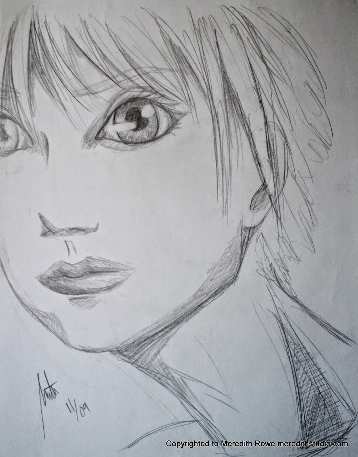
Sketch Diary: TBT - weird proportions face

A little throwback sketch from November of 2009.

Not a clue what I was going for with this sketch. Most likely it's one of those 'I don't know what to draw....' and then the pencil just sort of goes 'blargesndofpaos' all over the page until I feel I've gotten whatever it is out of my system. Sometimes those kinds of sketches turn out something super cool. This was not one of those times. Still, I wanted to share it with you because errors are just as important as successes. Enjoy!

with love - M

Friday, October 3, 2014

New lens! Some test shots with a 50mm


With a new job comes new fun toys! Well, this can also be used for work but you know what I mean. I bought a new 50 mm 1.4 Canon lens this week and here are some of my first shots. Check out the rest of the album here. The puppy up top is my akita, Baku. He's a pretty good sport with photo taking but I think big cameras freak him out a bit. Still, I think I got some nice shots of him.


This super cool boat belonged to my boyfriends grandfather I believe. I love how the 50mm blurs everything but what's being focused on. I think it makes this boat seem bigger and more real.


 Just a view out of my living room windows. Can't wait to try this out with portraits.

with love - M

Thursday, October 2, 2014

Sketch Diary: TBT - LDS girl

Time for a throwback all the way from 2010! I still remember sketching this like it was yesterday. This was one of those pieces, one of those moments where everything came together and I could really see the subject - not with my eyeballs but with my true mind's eye. Clear as clear can be. And if felt like liquid fire running down from my head to my hand. Whenever I look at this sketch now, I feel that same sensation and say to myself "Hey Meredith, you should really sketch more from live subjects - at least use some photos". I was using more photos at one time but have since fallen off the horse. I wanted to post this as a reminder to myself to embrace drawing from photos/ real life more. Pulling from my head is fun and all but I'm not a mentat. It's time to face facts and break out the photos.

Anyway, this sketch was of a young girl in a National Geographic who happened to be a member of the LDS church. Her face just jumped out at me and I felt compelled to try to emulate it. I hope it brings someone the peace it gave me.

with love - M

Friday, September 26, 2014

Sketch Diary: Buns and butterflies

This is kind of throwback sketch but shhhhhhhh it's been a busy summer. So here's a babe I back in Japan. I was a little obsessed with those head buns thing. I still think they're pretty adorable. I should figure out how to do them since my hair's so long now... and look! Butterflies! Hehe,

with love - M

Thursday, September 25, 2014

Sketch Diary: TBT - a throne to rule by

Time for some throwback! October of 2009 and I can't for the life of me remember what I was thinking when I did this drawing. Is she the kind sister aiding her ill brother? Is she like the witch in Snow White, having weakened or killed the king, she happily takes over the kingdom? Anyway, I still enjoy looking at it and wondering about a story.

with love - M

Wednesday, September 24, 2014

Sketch Diary: Contemplative vest kid

Ugh, the anatomy here is all wrong. Didn't much care for this sketch when I made it, I don't feel much differently now. I wanted that kinda scrunched up, hunched over feeling but the head looks oddly place. Ah well, NEXT!

with love - M

Tuesday, September 23, 2014

Sketch Diary: Assateague ponies

Quicky sketch from my camping trip to Assateague Island. Wild ponies are super cute... but also rats with hooves haha. Ask anyone who's had their campsite raided by ponies.

with love - M

Monday, September 22, 2014

Sketch Diary: Patsey

This was an interesting sketch to do. I was watching 12 Years a Slave when I got inspired by Patsey. I honestly don't like how the sketch turned out. I don't feel it captures anything true about her (except that lovely long neck). But it was still a good challenge. I don't usually draw with any particular race/ethnicity in mind. I think it's about time I started paying better attention to all those unique details when I draw. Or not. Who knows.

with love - M

Friday, September 19, 2014

Sketch Diary: Colored Carolina Girl

COLOR! Here's your surprise color piece! Mmmm I love Copic markers. The hairpiece was inspired by real hairpieces made by a talented lady in Calabash, NC, that I saw in a little art gallery a few days before I sketched this out. I was trying to go for a watery feeling when I colored this but mainly, I was just playing around. I like how it turned out, for now. I was worried I over did the white paint splatters.

with love - M

Thursday, September 18, 2014

Sketch Diary: TBT mer-person concept

Androgynous mer-person! The written note says "no males or females - fins fold up for courting and defense". An old sketch from the year after I graduated college. Not sure what the bun looking things on it's forehead are... maybe hair? I forget.

Wednesday, September 17, 2014

Sketch Diary: Belt buckle girl

Nothing special here. Just a girl with lots of belt...buckles. I don't know. I just work here.

with love - M

Tuesday, September 16, 2014

Sketch Diary: Carolina girl

Cute, random, story behind this drawing. when I did the initial sketch, I was in North Carolina visiting my family. They were going to church one Sunday while I was there and I decided to tag along for the drive since the church happened to be near a cute town I had visited once before called Southport. So I dropped of the 'rents and headed into town to find the little sitting area by the waterway. I found an open picnic table and sat down to sketch a little in the beauty and peace of the waterside gazebo-type area. My peace and quite did not last long...

First, this group of ladies nearby were talking (loudly so it was hard not to eavesdrop) about how they like being near the beach but can't handle the sand. One would say something about how gross sand is or how it gets everywhere and they others would respond with something like "OMG yes! You're so right!". The kicker was when the one girl proclaims that she needs one of those pools that sits next to the beach, so the sand is right there... but she can be safe in her clean sanctuary. One of the ladies proclaimed her a genius and they sighed in unison, I'm assuming while they imagined how wonderful that would be. I guess there also wouldn't be wind in this pool bubble world. Then the fun began. This big old salty lab comes barrelling up to the table area and proceeds to request pets. Then he climbs onto the table, yeah onto, and lays down so that these ladies can have better access to petting him. Meanwhile they're scrambling to get their purses and such out of the way because this is one salty, salty dog. Also wet, presumably from the water, you know, 50 feet from us. Soon after, a time-worn, gentle soul comes wandering up, apologizing for his dogs ridiculousness. I was just smiling the whole time. The ladies were good humored about it and actually pet the lab as well as his other friend (she remained on the ground). Evidently both dogs were rescues that this man had taken in after putting his daughter through college. That was after he'd been through at least 1 major war. People are fascinating.

Eventually, the ladies left, the salty dogs and gentle soul went about their business, and I was left to draw in peace... for a time. Soon enough, one of the ladies sitting behind me stood up and gasped really loudly and for a moment I was concerned something was wrong. She leans forward to look over my shoulder and apologizes for startling me, but that she was surprised to see that not only was I drawing, but I was drawing something good haha. Her husband agrees in a harumph and chastizes her for surprising me. She suddenly gets worried that I might have drawn a huge line across my page and ruined the "30 hours" I had put into the drawing. I giggled and insisted myself and my drawing were fine and thanked her for the appreciation. She gave me a hearty "Keep up the good work!" and left. Another young girl came over while this all went on and got very wide eyed while peeking over my other shoulder. I asked if she liked it and all I could get out of her was a very excited, rapid nodding of her head.

I finished up in about 45 minutes total and headed back to pick up my parents. It amazes me how many interactions a person can have in such a small amount of time. Reminds me of goings to conventions and wandering the artist alleys. The moral here is to always bother artists. Let them decide if they want to put down their brush and converse further but always express your feelings when you find beauty in something. It always means the world to me and I imagine most other artsy folk feel the same. We love what we do. It's an added bonus that you love it, too.

with love - M

Monday, September 15, 2014

Sketch Diary: Arrow fanart

Look! I'm still here! Mostly. Fulltime gig has me beat when I get home but I haven't forgotten my pledge to improve my artsy skills. I've got one nice (colored up) surprise coming up for the Sketch Diary this week but you'll just have to wait!

Ah Arrow. I wish I could keep watching this show. I can't put my finger on it but something about the live action TV show has become tedious, boring. It certainly isn't the man himself (I could just watch him walk around picking daisies all day and I would be entertained). Maybe I'll come back and try to finish it in another month or so.

Anyway, about the sketch - I'm not good at doing manly bits. The arms, the abs, the jaw, the knee caps... it's all a bit overwhelming for me sometimes. But this was quite calming. "Just draw him standing there" I told myself. "But I wanna do something coooooool! Like him crouching, taking that kill shot, his hood caught in the wind, angels flying out his butt!" myself responded. "No, Meredith. Keep it simple. The crazy stuff will come later." "Ok... I love you." "I know."

with love - M

Friday, July 4, 2014

Sketch Diary: Harpy dwarf girl thing whatever

Another example of not just letting something run off the page... those darn wings are way too small. Whatever. It's a dwarf harpy. There, ya happy! No. I thought not. Well enjoy the detail on those feathers and scales instead. Because that took forever. No, not forever. You know what I mean. It was arduous. I've decided to make this difficult anthropomorphic beauty my chosen creature thing for this other thing I'm doing with some people. So let's consider this chick (hah, see what I did there) step one. Bird structure is not my strong suit. Wish me luck.

with love - M

Thursday, July 3, 2014

Sketch Diary: TBT - the elf phase


Yeesh these are old. Was cleaning out some papers and found these babies. What was it about this weird 'elf ear, thick bangs' phase? I'm glad I'm past it, that's for dang sure. I also hope my anatomy has improved :cough: don't respond to that. Anyway, be free my sketches. Off to poison another young artist with that weird 'obsess over a physical feature' phase.

with love - M

Wednesday, July 2, 2014

Sketch Diary: awkward horn girl reject

Meredith - it's okay. You get to the bottom of the page and you run out of room. This does not mean you need to make the figure disproportionate in order to fit the ENTIRE figure on the page... just leave the legs hanging off. It's okay.

NO IT'S NOT! Must include everything! Lol. So silly. Learn well, children. This is what not to do.

with love - M

Tuesday, July 1, 2014

Sketch Diary: KERA girl in the best coat ever

And another older sketch from a KERA magazine in Japan that finally got inked. I think she turned out well enough. An attempt here to include a bit of the background. I get so bored by the time I get to the background. It's a serious fault of mine. But I always feel more complete when I take the time to do it. I don't understand why I keep denying myself. It's like not putting sprinkles on my ice cream because the container is out of reach and I'd have to get up and walk over to it. JUST GET THE SPRINKLES! Ok, ok, I will. Maybe. I want that coat...

with love - M

Monday, June 30, 2014

Sketch Diary: A finished color piece! Snow White

Ta-dah! I give you - Snow White. Or whatever. Doesn't have to be her. I just liked the look she was giving the camera in the original photo. I forgot how much I enjoy working with these markers when I just go with the flow, try not to think too much. She feels so alive for me right now. Like all I want to do is look into her eyes and make all my dreams come true :sigh:. In 2 months I'll hate this picture hahaha. That's just how it goes. But for now, I'll just enjoy it.

In case you're curious, I use Copic markers. I have used Prismacolor and Shin Han but these Copics man... can't beat alcohol based. The room might smell like rubbing alcohol while I draw but it's a small price to pay to be able to actually blend colors like watercolor paints. It's like magic. I don't remember who I bought them from online, a small dealer in the States somewhere, but just make sure whoever you buy from has good reviews and that your getting the markers you want. I only buy the refillable ones, not the one and done dudes. I LOVE refillable markers. I don't understand why markers should be made any other way. It's so easy. The only issue I ever ran into was that you have to ink with the right kind of pens. Of course copic has their own brand of inking pens but I think as long as it's not also alcohol based, you're good. Otherwise, they blend together and that defeats the purpose of inking for me.

Oh and the paper... just plain old copy paper. The slicker the better. I find that though I like card stock, it tends to soak up so much of the ink. Good if you want to do a lot of blending and layering but for just practicing and goofing around, I prefer to keep it cheap.

with love - M

Friday, June 27, 2014

Sketch Diary: mermaid idea - fiasco necklace

This one is kind of a double post. I already posted it on a little project blog I'm working on with some other artsy folks but I wanted to put it here, too. Cuz let's be real, I'm rather pleased with it. She's super skinny... I know, bear with me. But I like that you can really see the gills, ya know? What took the longest was that silly necklace. You would've thought I was painting the Mona Lisa with how much time I spent on that piece of jewelry! And I don't even like how it turned out! This is why I move through my sketches so fast (rarely more than 30 minutes on a single figure). I feel like I end up spending too much time on the details and I end up missing the big picture!

with love - M

Thursday, June 26, 2014

Sketch Diary: TBT Totoro mini comic

Almost missed my chance for TBT this week! And what a special little piece of paper it is, too. Another piece filled with memories. Being cold in a Japanese winter, seeing little Totoro figures EVERYWHERE. The little strip at the bottom... I thought was quite genius at the time haha. I hope it makes you smile. Now I need to go watch a Ghibli movie! Gets me every time.

with love - M

Monday, June 23, 2014

Sketch Diary: Girl sitting on air

Just a girl... in a slightly awkward pose hah. Not sure what I was going for here. Feel like she should have wings but I just wasn't feeling it at the time. Wanted to play with hand positions and spinal curve. That head is definitely too big though, an error common with my sketches lately. But I'll waste no more time on it! Off to the next victim of head enlargement.

with love - M

Friday, June 20, 2014

Sketch Diary: Snow White and the apple from KERA

Old sketch, new ink. I loved reading (what little I could read, anyway haha) KERA Magazine while I was in Japan. So much fun stuff in there - shiny things, unique outfits, wild ideas for accessories, and great photo shoots. If you see a good one, pick it up for me ^.- ! This particular page was of fairy tales - Snow White specifically. I fell in love and sketched it while I was in Japan. But just the other day, I finally sat down and inked it. Maybe there's some color on it's way and it can be finished finally! It was suprisingly relaxing and rejuevenating to ink this piece so hopefully coloring it will be the same.

with love - M

Thursday, June 19, 2014

Sketch Diary: puff pants archer

Ready for some TBT (Throw Back Thursday)?! This was sketched and colored way back when I was in Japan. Just a quickie. But to be honest... at the time, I truly hated this piece. I mean loathed it. Loathed it so much I didn't color anything for a months and months afterwards. I buried it away in my sketch pile and forgot about it until recently.

Sure, it will never be a favorite of mine - now it's old and I can see the faults pretty clearly. But there's something about it I enjoy now. Maybe it's the memories it brings back. Maybe it's the strength and power in the pose (as compared to my other sketches which are usually so curvy, sensual). And I love the pink to yellow hair combo.

Anyway, anyone else out there that has work they hated years ago, I hope you're able to look back now and appreciate it for what it is and what it can give back to you now.

with love - M

Thursday, June 5, 2014

Sketch Diary: an eye, a figure, and a floating head

I once had an illustration teacher that loathed floating heads. I quickly got into the practice of adding shoulders in some way so it was more of a bust, way more classy. I always got good marks from him for my sketch homework after that. My real issue... is floating eyes. Singular, actually. As you can see here.

AHH! That hand. Don't look! Just keep staring at that eye. Or the pointy bit at the end of that dude's nose... that's my favorite.

with love - M

Wednesday, June 4, 2014

Sketch Diary: bird just hanging out

I can't remember where I was or whether I was looking at a picture or a real live bird when I sketched this... that's so spooky. It was while I was in Japan and they do indeed have huge ravens there so it could have been live. Anyway, I feel pretty good about it. I know, another old sketch but I've been busy workin', alright! Got's to pay bills. Hah. Get it? Bills. Bwahahaha.

with love - M

Tuesday, June 3, 2014

Sketch Diary: facial expressions practice

Sometimes folk ask me how to make faces. I don't know. I just make the expression on my own face and look in a mirror usually. There's also TONS of tutorials out there on practicing facial expressions. I obviously have my own favorites (distrusting, eager, and sad... although my favorite version of sad isn't on her. I guess it's more of a concerned look). So go search face tutorials/examples on deviantArt or anywhere. I probably used one to do these though I can't seem to find the link. If you are familiar with it, please link to it in the comments for me! Thanks!

with love - M

Monday, June 2, 2014

Sketch Diary: old Sherlock sketches

One of my favorite past times is sitting down to watch a movie I love and periodically pausing it to do sketches of what I see. This is a thing best done... alone. Typically, no one else enjoys doing this with me since the pause can take up to 20 minutes. Makes for a really long movie. Regardless, I highly recommend it because it's helped me tremendously with depth and angles and dimensions.

I know, this is an older sketch - but never before seen! I vividly remember doing this sketch so it's near and dear to my heart: sitting in my tiny apartment in Japan, on my floor couch thingy, my little heater blasting, day dreaming about the next trip to the local kaitenzushi (conveyor belt sushi eatery).

Btw, hats are hard...

with love - M

Wednesday, May 14, 2014

Re-Post: The Noun Project - Making my life easier everyday

Original post from my old WordPress blog: "The Noun Project might be old-hat for some but I only just learned of it this year. Thanks to my Creative Director at work, I now have a resource that I come back to time and again. I wanted to help support this wonderful site but sharing it.
So what is The Noun Project? “The Noun Project is building a global visual language that everyone can understand. We want to enable our users to visually communicate anything to anyone.”


From my experience, in a corporate setting we use these symbols in brochures and catalogs to help convey or reinforce an idea. Instead of bolding or headlining something you want to call out like ‘Fresh foods’, I might use a carrot symbol. Or instead of ‘weather resistant’ I might choose an umbrella. And it can get deeper than that, no doubt. I look forward to using more of these symbols, making smart selections for witty correlations.
Now I hope you all use this resource to help better your designs and communications. Some are free, some are not. Even if you’re not a designer, next time you think about using clip art, I hope you’ll decide to step outside the box.
They download as .svg so you’ll need a program capable of reading it and saving it as an .eps or .png. If you don’t have Adobe Illustrator, Gimp is a free open source program that does the job just fine."

Some updates to this - now you have to sign up with the site in order to download and all of the icons must be attributed unless they are bought, under $2. Once downloaded, the zip file now contains the .svg AND a .png so you no longer have to have a program to change them into .png. They also have cool 'kit' options now, kind of like a lightbox on some of the major stock photo websites. The premium paid levels are really varied, too. I mean really, $10 a month to not have to attribute all the time, that's a pretty good deal.

It always amazes me how many designers don't know about this site. It makes me wonder how many awesome sites are out there that I don't know about...

with love - M

Friday, May 9, 2014

Re-post: RõSõz Logo Design and Branding


Original post on my old WordPress blog in October 2010: "A freelance seamstress thought she just needed some business cards and ended up creating her own brand with me as her design guide. Time and money were limited for this first step of branding but we managed to agree on these two as the final designs."

So this was for my Mom. Why I didn't just say that, I don't know. Being so close to Mother's Day, I felt it appropriate to revisit this piece. The whole project was as simple as - she asked me if I could make her some business cards and I did. However, this was when I was establishing how I wanted to ask questions to clients so I experimented with a questionnaire on her for establishing a brand. Questions like "who are your competitors?" and "what animal best represents your company?" and so on. She was a great test subject and gave me a bit of a challenge with the typefaces, if I remember correctly. I had a whole list and she kept wanting to pair up typefaces that I specifically separated. The flower design was the easiest part because it was a vector version of a photo I took of a hair piece I had made out of satin. And the name - RõSõz - is kind of ridiculously perfect. Her last name is Rowe and she sews... done.

When it came time to choose a design for the business card, it just wasn't happening. She liked them both and wanted both versions to hand out. Maybe she thought the more colorful one would be good for artsy people and the standard one for the more square folk. She says she got a lot of compliments on them and ended up giving out my business card to folks, as well. I haven't heard from any of those people but hey, promotion is still promotion. 

Personally, I think people have been scared to talk to me (and other designers) about design work in the past. Like I was some artsy seraphim that can only be called upon for the most serious of projects. Seems like folk are wising up though. Trust me, no matter how silly or small you might think your idea is, there is a designer out there just itching to help you. And I'm not saying that like "oh we're so desperate for work" because even I have turned down work in the driest of seasons because of various reasons (usually because the client was untrustworthy or rude). What I am saying is that we love to take ideas and make them into functional works of art. Love it.

I hope ya'll don't mind a few more re-posts from my old blog. I just really like a couple of the topics and didn't want to leave them behind in WordPress land. 

with love - M

Wednesday, May 7, 2014

Abby Howard and why I think her work is fantastical

Thank you, Penny Arcade folks for introducing me (and many others) to a wonderful artist and blossoming story teller - Abby Howard.

The Nerve of Some People
Before I go any further, let me preface this whole post by saying I feel a little odd talking about a person here. Typically, I'm used to discussing websites or tools or pieces of work... not a person. Let me know if I'm doing it all wrong, please. I'd rather not have her or her fans get upset and make me go insane by hacking my computer and installing strange programs and make it look like it has a mind of it's own or that it's out to kill me or something. Not that they would do that... that's just where my mind went.

ABBY HOWARD has changed my life. Not in that extreme I-was-going-down-a-dark-path-but-no-longer-thank-to-Abby kind of way. More like the I-now-have-a-better-understanding-of-things-I-want-to-accomplish-in-this-life-and-how-to-get-there kind of way. That was way too many dashes. 

This is also why I thanked Penny Arcade at the beginning of this post. They played a large role in it all. If you haven't already watched Strip Search, maybe it's time you did. If you have any interest in every creating your own comic (web or otherwise), watch it. I found it super enlightening and entertaining. Within it you will watch heroes rise and fall. Heroes like Abby. She went through a lot in that little web series. I don't feel like I know her or anything but I could definitely sympathize with her and several of the others. Being female myself, it was empowering to see fellow ladies-at-arms, not behind their web comes on the internet but out in the open for all to see (and judge!). Abby specifically seemed the odd ball at first but as with most human beings, the more we saw, the more we understood... her genius

Let's get to the good stuff. Abby now has two running web comics. The first is called Junior Scientist Power Hour or JSPH. It's light, it's fun, and sometimes my face hurts it's so funny. Always, it entertains me. Maybe my kind of humor is a little different... whatever. JSPH is her long standing comic with no over-arching story, just funny slice-of-life kind of stuff. After her experiences at Strip Search, she decided to dive in face first and do a kickstarter (that was way successful) for her new comic The Last Halloween. It's several pages in and the art style alone is enough to keep me hooked. Every week I look forward to these two comics. But why...

Maybe it's the dark material, maybe it's the style of illustration, or maybe it's that cat. Whatever it is, it makes me smile and that's what matters. I know I can peruse through older posts and find a treasure I had forgotten about. I know I can look forward to new pieces of  web comic gold each week.

Draw on, Abby Howard. Draw on.

with love - M

Friday, May 2, 2014

The Designer's Survival Guide: Thank you Richard Baird

Go here. Do it now.

This site has been sitting on my top bar in Chrome since... well since I've had Chrome. Which is a long while. I feel the need to pass it on and discuss it in all it's glory. If I ever were to make such a guide, I hope it will be as helpful to others as this one has been to me.

You may be asking yourself - "Why do I need a guide? I'm the most glorious designer that ever was and I have clients coming out the wazoo." Good for you. I hope a spider lays eggs in your ears. Show some humility! As for me, I grab at every 'guide' I can get my hands on because I don't want just one perspective, I want all the perspectives. I want to be prepared when I get that project that makes me jump through hoops or that client that doesn't has trouble communicating what they want. I want to know ALL the ways I can promote myself without blatantly advertising.

There are 22 categories now. When I first saved this site, I think there were half as many. I'll just touch on a few of my favorites.

  • Education - Obviously, I'm personally a bit beyond this issue now but this section still holds lots of useful information. Being a college-grown designer, I did loads of research into what I want out of a school for a graphic design degree and it astounded me how many schools I visited fell short of even the most basic standards. It was a lot of work but I feel I made a better choice because of it. And I didn't even want to be a Graphic Designer to begin with - I wanted to be an Herbologist... Anyway, I know some other folks that didn't need college or just took a couple courses here and there on specific programs (with the internet how it is now, you can learn all about the design programs without ever stepping in a classroom). I'm glad it's still acceptable to not have a degree and still be a great designer. 
  • Self-Promotion - SO IMPORTANT! I have witnessed a broad spectrum of types of self-promotion by freelancers and business owners. Sometimes it's dead-on. Sucks me in, makes me curious, establishes a sort of conversation/relationship. Sometimes it's just annoying. Like a person on a bus or train talking to everyone and no one about themselves and how deserving they are of your money. Of course sometimes I meet wonderful designers in my freelance travels, designers with a wealth of knowledge and a constant updating collection of wonderful work... but no one knows about it but me, the designer, and maybe they're cat. If you create things in any capacity, please read this guide. 
  • Pricing - I still struggle with this on a regular basis. The one system I always come back to was actually one recommended to me by an Etsy seller. (h * t) + m = x     Where h = per hour rate, whatever your time is worth to you. Be sure to think about taxes here, too! t = amount of time spent on project including meetings, emails, phone calls, etc. m = materials used be it a percentage of what you pay for that design program or that laptop or the paper and printer you used to make comps. x = the total, duh silly. Thanks to guides like this, I constantly re-evaluate what I charge for my time and how I explain it to clients.
Why are you still here?! Go check it out. Put your new knowledge and perspective to good use. Make your own guide. Spread the word. Tell me about it! I'm always looking to add to my blogroll.

And thank you, Richard Baird. You've made a difference in this designer.

with love - M

Wednesday, April 2, 2014

Sketch diary - snake girls

I do love me some serpentine women. No seriously, I've always been attracted to drawing mermaids, snake ladies, whatever. Something about the half and half thing is cool but I'm pretty sure there's something else going on, too. Snake-ity-snake. Snakes are really amazing creatures. I think I just want to switch out my lower half. That's probably what it is. I don't need legs. I wanna hang around in trees and swim all snake-y in the water and wrap my tail around my boyfriend so he can never leave... cough.

Anyway, I like their faces. In the sketch, not actual snakes. They don'e make faces. They have one face. Silly.

Ugh what is up with that HAND. Weird.

with love - M

Tuesday, April 1, 2014

Sketch diary - webcomic test run panels

And here is a test set of panels for the webcomic-yet-to-be. Five panels is a bit much, right? Nom nom nom.

with love - M

Monday, March 31, 2014

Friday, March 28, 2014

Sketch diary - expressions practice

Sometimes when I get stuck on something, I just move on. So doing a series of facial expressions can be a good way of moving the brain around those road blocks. This page was for a character based on a friend that I was chatting with at the time about making our own web comic. Hasn't gotten traction yet but I think it's good to get those ideas out there. See what flies. Or falls. Regardless, these were fun to do. I feel like some expressions aren't so different between characters but it all ends up being "well maybe I'll put that eyebrow here- look at that! and maybe the mouth a little bit lower - yuck, definitely not". Makes me feel like a scientist... of faces.

with love - M

Wednesday, March 12, 2014

Sketch Diary - just dancin'

 This started as a sketch of a pin-up style lady but things didn't work out. The hair came from a wig I have (in purple and blue, of course). Not sure what she's wearing though. I enjoyed sketching it out nonetheless. What does she look like? A Jane maybe? I'm feelin' Beatrice or Anna.


Friday, February 28, 2014

Sketch Diary - monster day


Creature feature! So a little known fact about me: I like drawing creepy things. Monsters, creatures, aliens, abominations, whatever. There's a lot to be learned from drawing natural human forms and I love classical portraits but there's something freeing about losing all constraints on the imagination. Want to add an eye on it's elbow? Sure. Maybe switch the mouth and the eyes? Go for it. There are no limits. I've gotten weird looks from people sometimes and I know it can be scary for parents and caregivers out there to encourage a child's imagination when they are drawn to possibly horrifying ideas, but please encourage them anyway. I tell family and friends all the time about how glad I am that my parents let me watch imaginative, though sometimes frightening, movies and video games. I'm getting older now, so these were movies like Alien and Aliens, Indiana Jones, Star Wars, The Labyrinth, The Dark Crystal. And I was 5-7 when I saw most of these for the first time. Now, I didn't fully comprehend them until more recently, of course, but the imagery was so impactful that I continue to use these films as inspiration today. I'm not saying run out and show your child Prometheus. I just want people to think about how limiting the imagination to only soft, safe, or classical exposure doesn't have to be the only way to go. We don't have to be scared... of being scared.

Phew, did not think that was going to be so much to type. So about the actual sketches: I looooove my razor mouth dude in the upper right corner. It's very 'sandworm of Dune' inspired. Don't know what's up with the other guy on the right. I was watching The Thing at the time. And the guy on the left was going to be a real monster but turned into kind of an alien in the end.

Thursday, February 27, 2014

Sketch Diary - just another pretty lady


This is a sketch from January but I'm behind a day or two on my sketch diary. I can cheat. It's my diary, after all. So this was a quicky done on the train one day that I was going into Philly for freelance work. I'm trying to get back to sketching just what I see in my head at that moment instead of thinking about it too much. 
I don't know what to title these posts. These sketches rarely get so refined that I can give the characters a name or association of any kind. But maybe I'll do that. Whip out a baby name book and just start naming these people. 

Friday, February 21, 2014

Sketch diary

A quick pencil sketch of a dancer waiting her turn. I was supposed to be doing warmup posture sketches, like 3 minutes per pose. But I didn't make it past the first pose. Ah well. Next round.